We’ve chosen some of the most stand-out uses of the Pantone Colour of the Year 2019. Get inspired to create your own Pantone Living Coral interior.
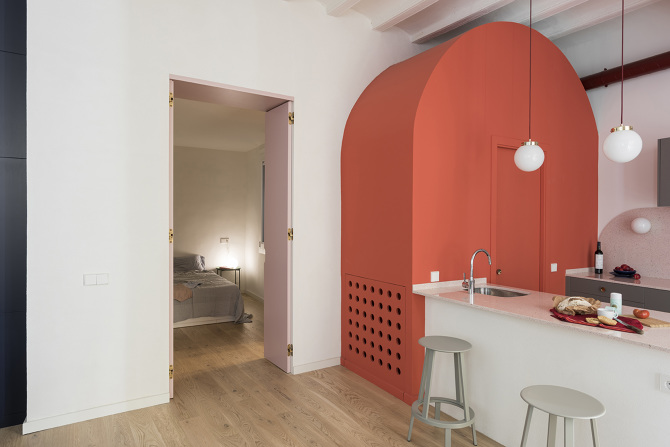
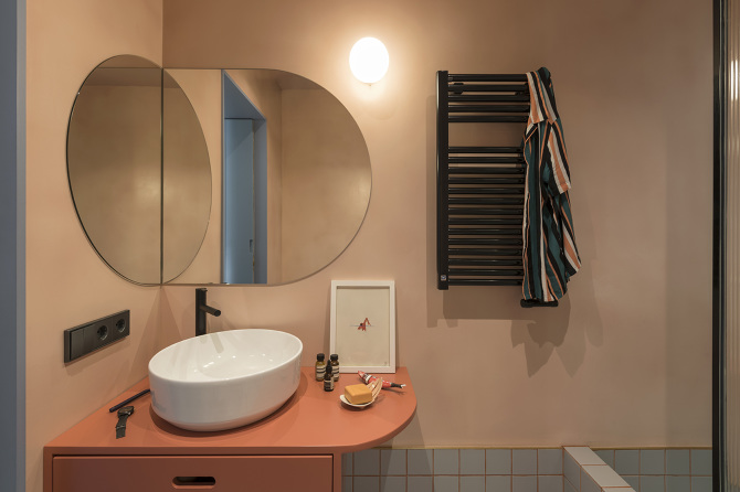
BCN in Living Coral by Colombo and Serboli Architecture, CaSA
You might have already seen this at Dezeen, AD,or Design+ because the Barcelona design studio CaSA (Colombo and Serboli Architecture) gives us one of the best examples of how to use the new colour of the year. When renovating an apartment in El Born, they maintained a colour palette of pinks and greys that breaks up the Living Coral used in the guest bathroom, one of the elements that brings the most personality to the project. “We chose a fuller and darker shade because we were looking for a colour that strongly underscored the lightness of the monumental proportions of the apartment, which has four-metre high ceilings,” explain Matteo Colombo and Andrea Serboli.
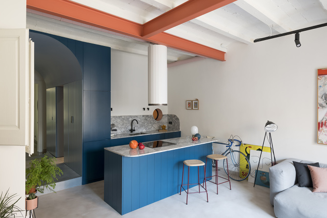
They liked the result so much that they decided to reproduce it in Andrea Serboli’s own house, but in this case, they took a chance on a “lighter and brighter tone, almost that of lobster, because it was for specific accents”, such as the beams, the bathroom cabinet, and the laundry door. Design Milk, Yellow Trace and Elle Decor also fell for its charm.
From bathroom to kitchen
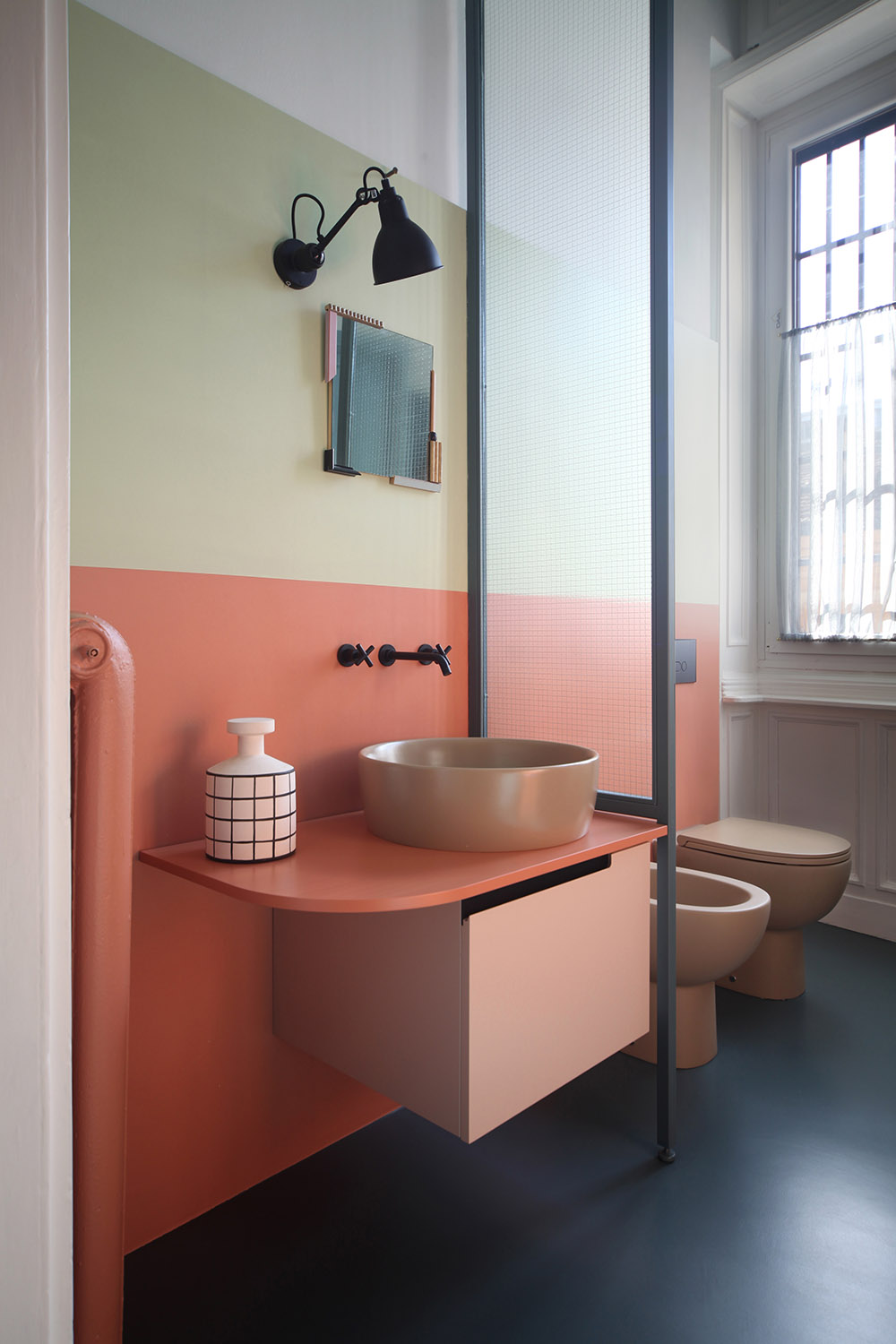
The bathroom seems like the perfect place for the new colour of the year. Marcante Testa took a chance on it for the bathroom of this renovated apartment in Milan, which caught the attention of Estudio Alegría: “coral is the protagonist in the lacquered furniture and the wall overlay. It contrasts with the metal and glass and combines perfectly with the rest of the cold tones”.
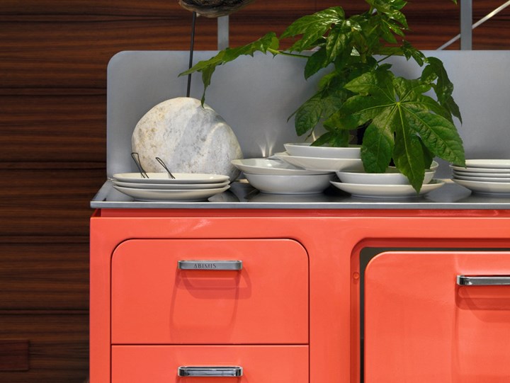
The kitchen also becomes more interesting with the use of Living Coral. Abimis counters the coldness of the steel with this warm and vibrant tone for the cabinets.
Climbing the walls
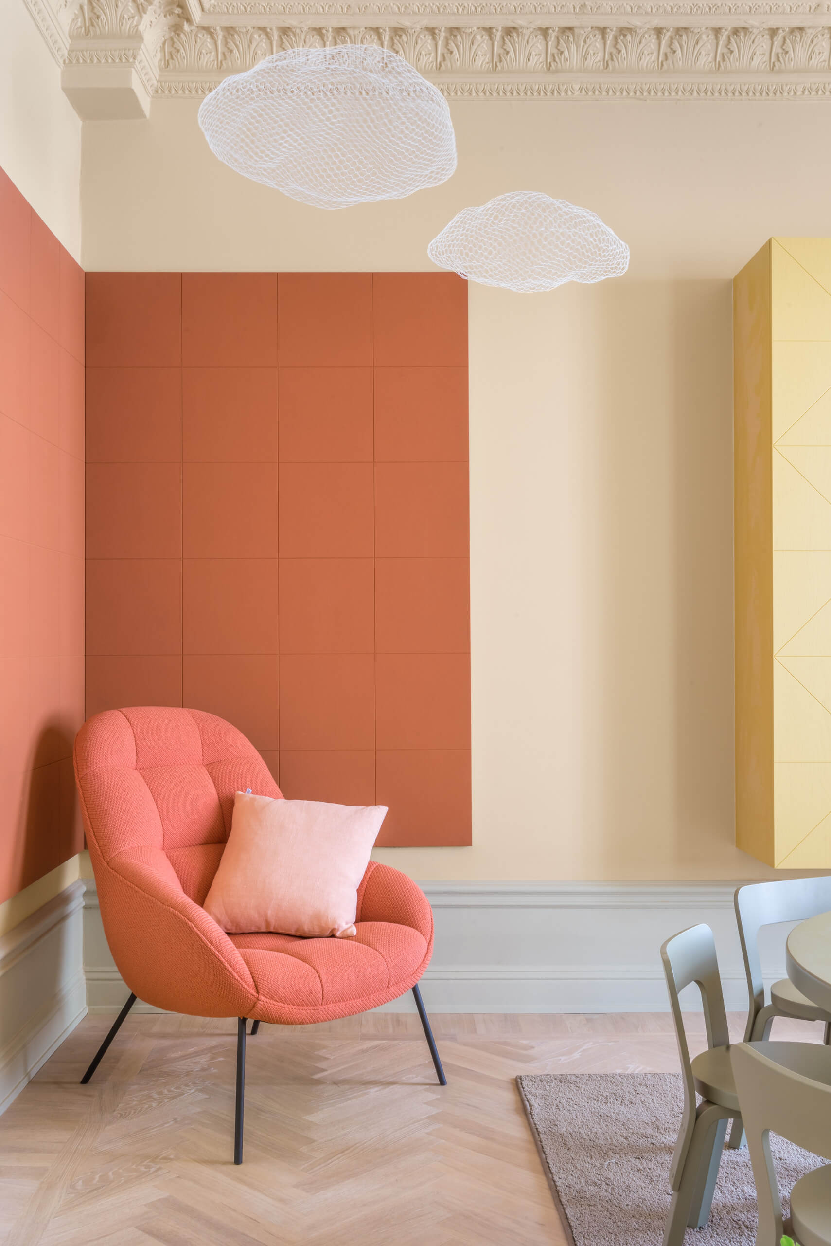
Hidden Tints is a project from the Swedish Note Design Studio where the original pastel tones are combined with more vibrant ones like Living Coral to create a serene atmosphere that is still full of colour.
The building that’s triumphed on Instagram
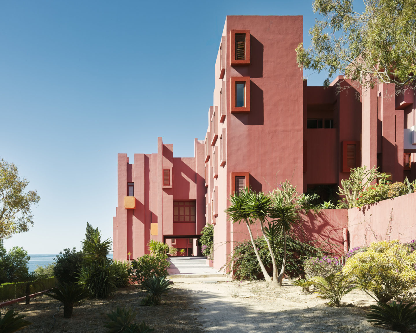
Matteo Colombo and Andrea Serboli point to Ricard Bofill as a reference when it comes to the use of colour in their early projects. Among them is the residential complex La Muralla Roja on the Calpe coast which uses red and pink tones to contrast with blues and golds to spectacular effect. It’s a mixture of colours, sculpture, and architecture that has recently triumphed on Instagram.
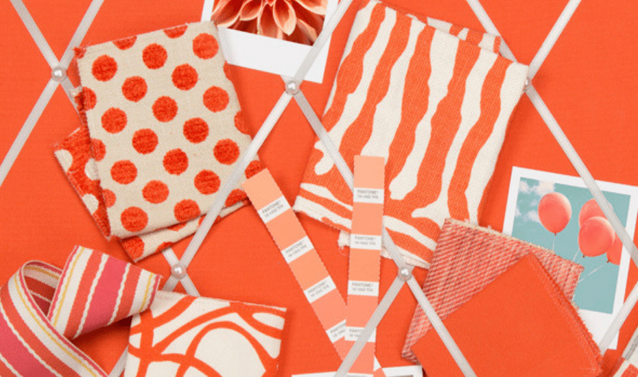
Fabrics that add a touch of coral to your home
Kravet has joined forces with Pantone to create an annual collection of fabrics inspired by the colour of the year. For Estudio Alegría, textiles and small decorative details are the perfect way to incorporate such an intense colour when decorating your home.
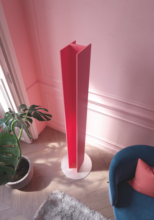
Living Coral to warm your home
We’re not talking about the warmth and energy that Living Coral transmits. We’re talking about the T Tower, a free-standing decorative heater designed by Matteo Thun and Antonio Rodriguez for Antrax IT. The order from Pantone is already reaching the catalogues of big brands.