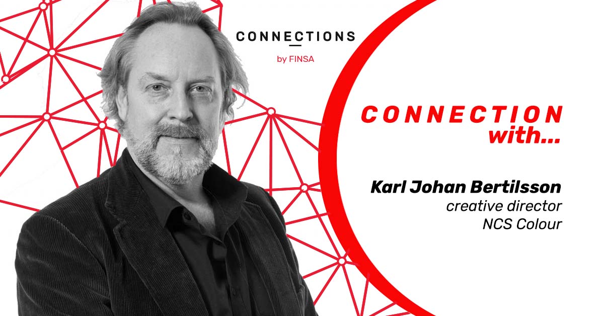
Karl Johan Bertilsson is one of the best colour experts in the world. At NCS Colour, he has helped designers, architects, businesses, and organisations develop successful colour strategies for twenty years. Since 2016, he has combined his role as Creative Director of NCS with working as a designer and consultant at Mr Karl Residence.
You are the head of the Colour Trend Forecasting Group, which develops colour palettes for the years ahead. How do you predict the colours that will dominate the next few years?
Trend work takes a long time. We have a workshop to which we invite experts from all over the world. We start by analysing current trends. Then we analyse the factors that are going to influence the future and where we are heading with colour, both in terms of hues and tones. Finally, we decide on the four main influences linked to the type of emotion that they are going to produce.
The most important part of the work is choosing a set of six colours for each of the four trends that will make us feel those emotions.
Once the collection has been decided on, we spend the next few months travelling, experimenting, and interacting with people all over the world, changing the stories and colours based on their reactions and comments until we reach a final conclusion.
What are the factors that determine colour trends?
New colours don’t just emerge. All colours exist as phenomena, and that makes colour trends different to other types of trends.
Colour trends are determined by two factors. The first is the natural changing of our preferences, which is cyclical and repetitive. When we are influenced by specific colours for a period of time, like the huge range of colours that have been available over the last few years, our subconscious gets tired of it and we want to go to the other extreme – neutrals. Along the way, our mind has to take certain steps – midtones. That’s why part of the work involved in trend design consists of understanding where we are right now in order to be able to analyse where we are headed.
External influences are the second factor, the things happening in the world that affect us and push us towards certain colours, hues, or tones, that end up being very popular. They are called “drivers”, and they can be local or global. Some of the “global mega drivers” identified by NCS for 2020 include urbanisation, climate change, the new feminism, digitalisation, and the new generation Z.
Our job is two identify both factors: where are colour preferences are leading us, or what our subconscious wants, and the relevant factors that are going to lead to certain tones or colour combinations.
https://www.instagram.com/p/BsnTwBFjABT/?utm_source=ig_web_copy_link
What are the colour trends for 2020?
In 2020, colours will become less bright. We are coming out of an era during which we embraced strong tones, like the colour orange, which dominated 2019. Then it became yellow, which is very trendy at the moment. For a while now, there have been a lot of blues and greenish blues in medium and dark hues.
The goal of our preferences our neutrals, whites, greys, and blacks. But before we get there, we have to pass through dark hue stages, and coffee and pastel shades, which is where we are mainly headed.
Where are colour trends headed over the next few years?
We are entering a period that will be defined by contrasts, in which many colours will be used but always with some contrast between them. They will be neutrals and pale colours combined with dark yet warm shades. Pastels will also feature. We are getting closer to a time that will look a lot like the post WWI period, the 1920s.
Are trends the same across industries or are there differences, for example, between interior design, fashion, and cars?
There are some differences. Our preferences work in the same way, however, buying a shirt in a trendy colour is an easier decision than buying a couch or a car in that colour. Only people that are very open to new things, such as trendsetters, accept fashionable colours in more expensive products.
https://www.instagram.com/p/B80tyOzJAsL/?utm_source=ig_web_copy_link
Are the characteristics of each colour from a psycho-emotional point of view taken into account?
Our psycho-emotional state is almost always reflected in the colours that we prefer. We pay a lot of attention to everything that affects our mental state and what is relevant to our preferences. However, the psychological effect of a colour can be very different for different people. We can establish, however, colour areas that the majority feel are connected to certain emotions.
Is enough time spent educating the designers of the future about colour at design schools?
Definitely not! Colour is one of the most important aspects of any design, but schools don’t even discuss the topic unless they are talking about mixing pigments, so designers work with it intuitively. This is a huge mistake, because colour always has a function and a meaning. Sometimes the smallest change in tone can be the difference between a design succeeding or failing.
Statistics show that around 75% of the new buildings in Europe are white or grey. If scientific research has demonstrated that colour is very important, why isn’t it being used? Because making decisions about colour takes time and, in order to do that, we must understand what we are doing. That’s why education about colour is necesary.
Do you follow trends?
We all follow trends, though most of us aren’t aware of it. However, it’s not always recommended, especially when it comes to products that are going to last us a long time. For example, in interior design, it’s better to use trendy colours for elements and details that can be changed regularly, like cushions or accessories, and not for furniture or on the walls, as we don’t change them quite so often.
What are your personal colour preferences?
I always prefer colours that provoke a reaction and make us reflect. A colour that always works is Yves Klein’s blue, which is one of my favourites.
NSC’s trends for 2020
NCS Colour Trends 2020+ identifies 24 colours grouped into four dominant global trends based on the most important drivers in current times, all revolving around the key word for 2020: awareness
- Evolving Eclecticism: Awareness of our environmental surroundings. Designs based on recycled, reused, and eco-friendly materials must show their authenticity, which is why blues are dominating, like in plastics, complemented by red and brown.
https://www.instagram.com/p/BzLBkkQojw4/?utm_source=ig_web_copy_link
- Shades of Incognito:Awareness of privacy. It’s related to translucent materials that show us a little without showing Colours are becoming more neutral, with red and greenish-blue tones. It is a very harmonious palette.
https://www.instagram.com/p/B1qIF6eBeUB/?utm_source=ig_web_copy_link
- New Masculinity:Awareness of traditional stereotypes. This is a very positive trend that is linked to a new generation of men and it includes traces of bright colours, with yellow being the main colour.
https://www.instagram.com/p/B3HWM5shKu4/?utm_source=ig_web_copy_link
- Human Identity:Awareness of the line between artifical intelligence and human identity. It is represented by blues and greens in medium tones that are easy to combine.
https://www.instagram.com/p/B5nCA_6hVfj/?utm_source=ig_web_copy_link