Jean-Gabriel Causse just released the novel The Day Without Colours), which is set in a black and white Paris and champions colours and their positive effects on our brain. The French writer and designer specialises in the influence of colours on our behaviour and encourages us to discover the power of colour in an increasingly grey world. We’ve collected some of the interesting facts from his study “The Astonishing Power of Colours” and applied them to interior design.
La vie en rose
Pink is no longer a feminine colour. It is seen as the colour of happiness and is ideal for stimulating positivity in childhood, which explains it’s use in day-care centres and schools.
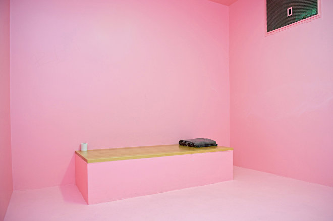
But perhaps the most unexpected use of pink is in prison. According to psychologist Daniela Spath, pink is calming and reduces anger, which makes it ideal for the cells of aggressive prisoners as well as mental institutions, recovery rooms in hospitals, and natural disaster refuges. One of the pioneers of this use of pink was the Pfäffikon prison in Switzerland.
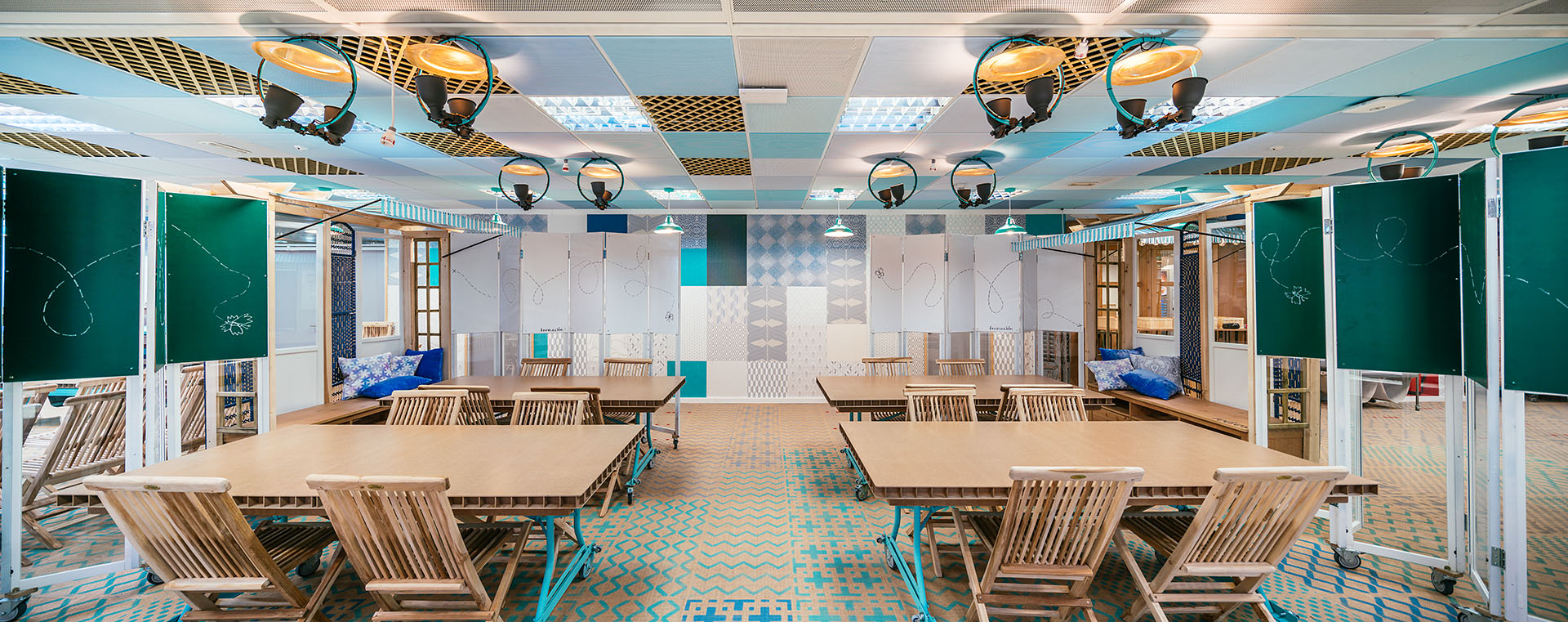
Why not have a blue and red office?
To take advantage of the power of colour on our behaviour, offices must stop being all white. If we want to boost creativity, we should choose blue as it helps us come up with original and innovative ideas. If we want to increase productivity and concentration, it’s best to choose warm colours like red, orange, or yellow.
Run away from monochrome
That doesn’t mean we have to paint the whole office red, but rather that the surroundings “breathe” this colour, something that can be achieved with furniture, accessories, or small pops of colour. In fact, a monochrome office is not recommended, as it means the composition of the space is not balanced. In order to avoid jarring colour combinations, we can choose to work with complementary colours and play with their saturation and intensity.
Green libraries
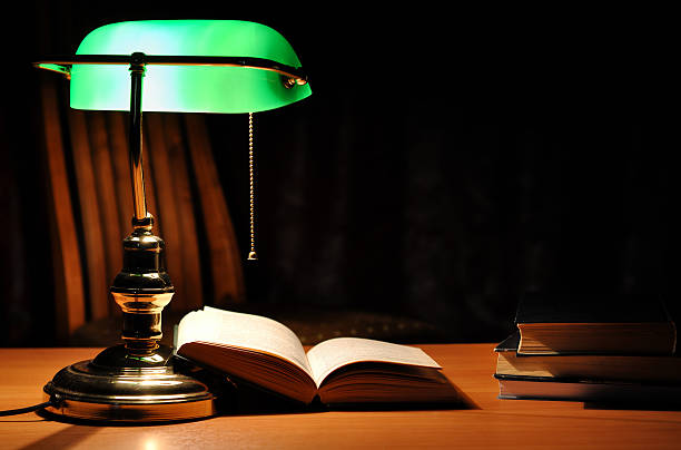
Green was always present in the elegant libraries of last century, from the wall coverings to the traditional Emeralite banker’s lamp, the light of which helped reduce eye strain while reading. Why green? Because it simultaneously activates the rational brain, which is necessary for concentration when reading, and the creative brain, which helps us interpret what we are reading.
The power of colour to cool us down
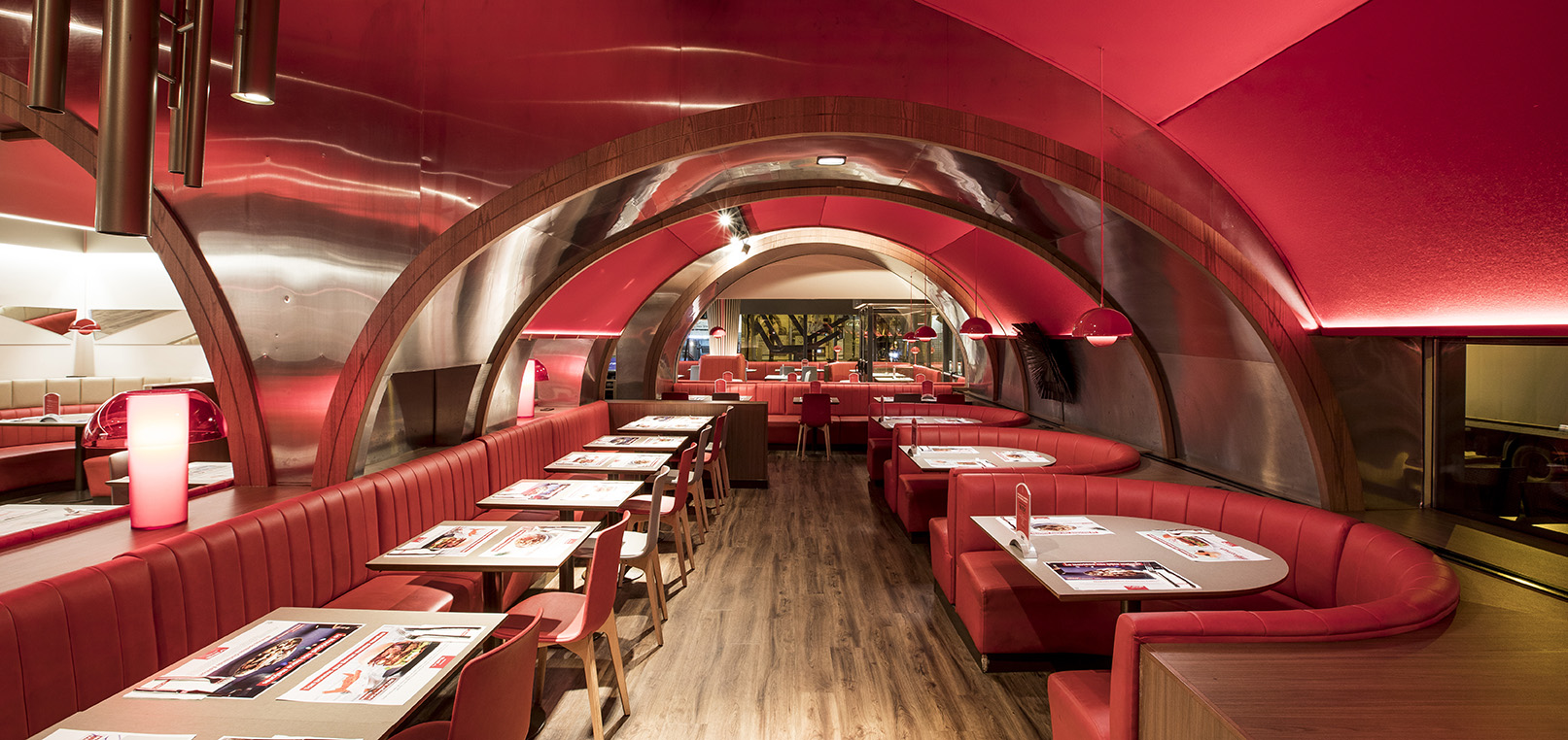
Colour also affects how we perceive the air temperature, even if it doesn’t affect the actual temperature. Given the heat wave that Europe is experiencing, you will be interested to know that we feel cooler in a predominantly blue space, perceiving the temperature to be two degrees cooler than it actually is. On the other hand, we feel two degrees warmer in a predominantly red space.
The best colour for sweet dreams
In the kids’ room, choose the calming effects of blue and forget about red, as it will get them too excited. Choose mauve for the older members of the family, as it combines aphrodisiac and relaxing qualities to help you sleep. For your teenager’s room, take advantage of the benefits of yellow, as it will help them be in a better mood when they wake up!
A kitchen that makes you hungry
If the colours of a dish influence your hunger, how can we choose a colour for the kitchen or the dining room? Several studies have shown that warm colours like yellow and orange whet our appetite. If you’re on a diet, choose blue as it has the opposite effect.