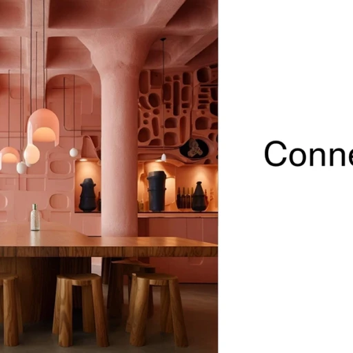
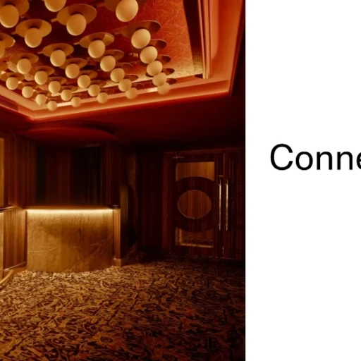
Raw aesthetic in interior design doesn’t celebrate the unfinished for fashion’s sake, but rather the sincerity of the material: surfaces that show their grain, their pore and their patina; a CMF (colour, material and finish) that privileges the tactile, deep mattes and controlled imperfections. In this post, we give you references to four solutions for an honest design with bare materiality.
The mineral layer: matte finishes with patina and relief
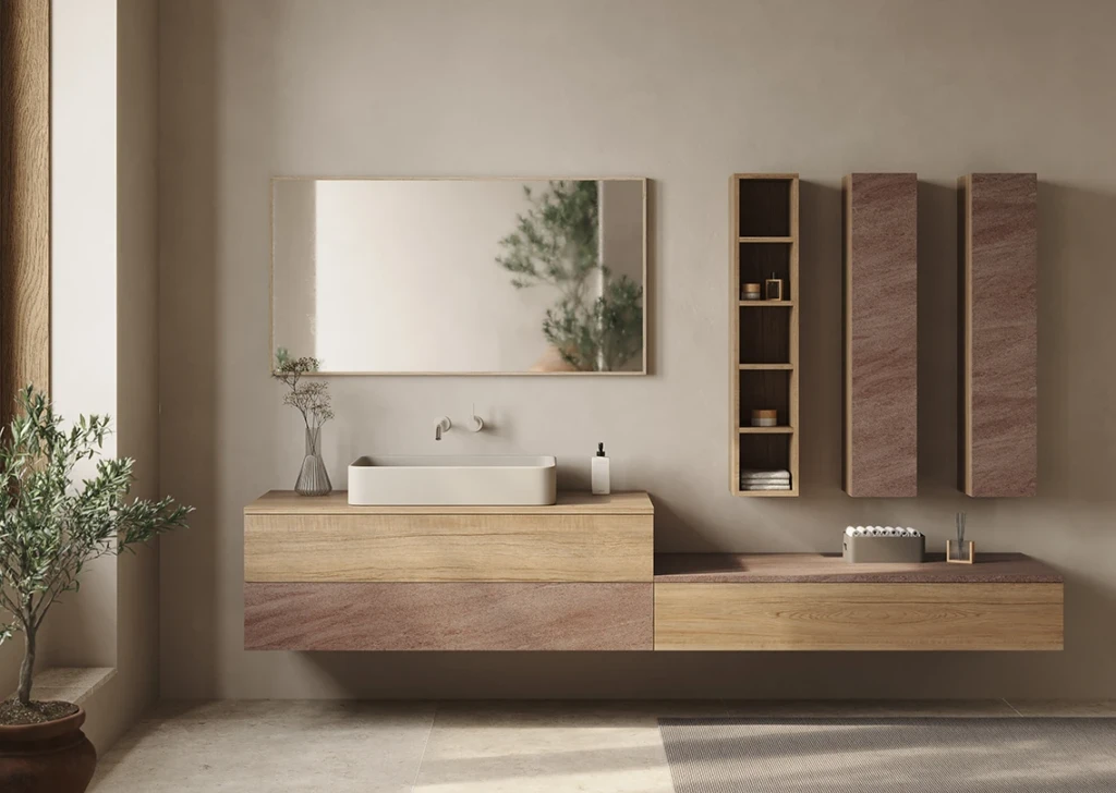
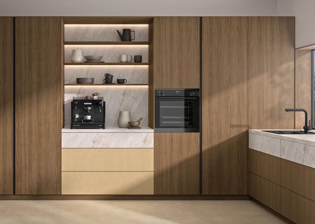
Mineral language brings calm and visual weight. Soft cements, coloured slates, and micro-reliefs that capture light without glare work well. In furniture and wall coverings, a contemporary stone-like reading, such as Creta Bronce Teide, from the Duo range by Finsa, introduces that toasted earth tone with a relief that suggests stratification without overacting, ideal as a background that unifies the space or as a monolithic volume in a kitchen island.
Textiles as a warm counterpoint
To avoid excess minerality, the raw material seeks visible textures and a comfortable feel. Tailoring-inspired fabrics balance austerity with tactile warmth. Tailor Camel Ari, another solution from the Duo range, incorporates a subtle warp with an amber hue that works on wardrobe fronts, acoustic panelling or retail, where a texture provides depth without chromatic noise.
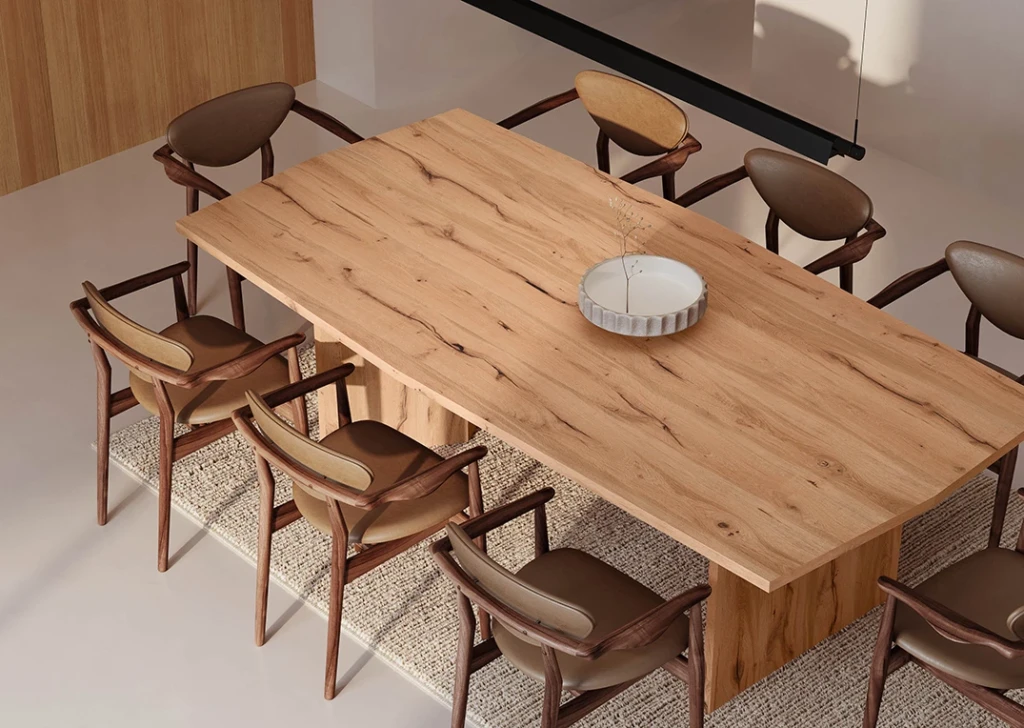
Solid wood: grain that breathes
Wood is the soul of raw: visible joints, moderate knots and matte finishes that allow the fibre to breathe. Roble Regio, from Finsa’s Studio Natur, offers a raw grain and a stable tone that dialogues well with cement and patina metals. Use it on extensive surfaces (continuous headboards, panelled fronts) to anchor the space and let the controlled irregularity of the sheet metal set the rhythm.
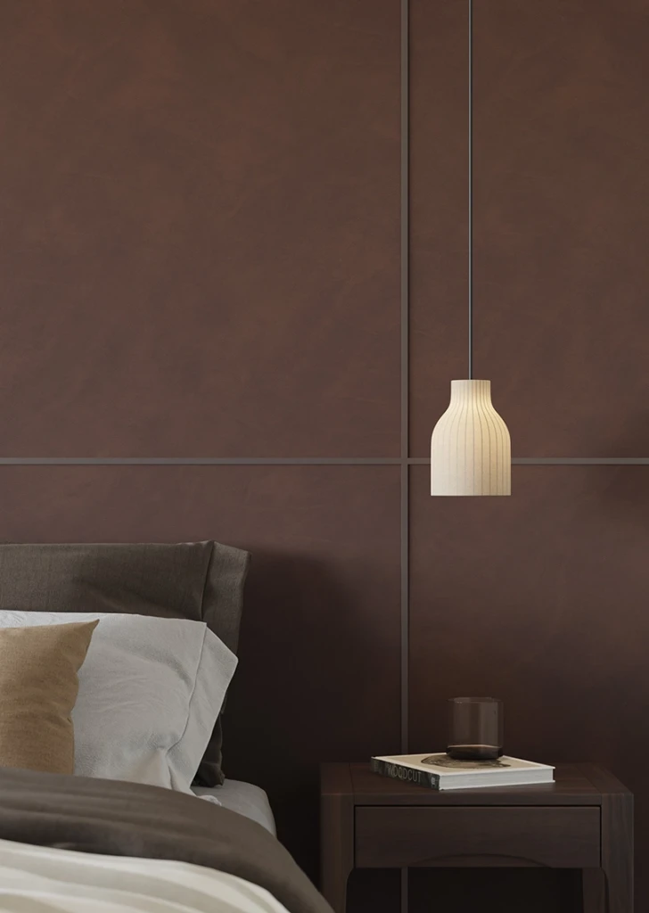
Raw aesthetic technical skins
The raw material is not rough: it also takes care of the contact. Surfaces with a leather-like feel soften the overall effect and add perceptual comfort. Pelle Original, from the innovative Fabric family, introduces an enveloping note in integrated handles, shelf ends or upholstered backrests, refining the rawness towards the habitable.
Palette, proportions and joints: three quick rules of raw interior design
We give you three keys to making the right choices in your raw aesthetic:
- Limited palette: earth, charcoal, camel and medium oak; leave colour for movable objects.
- Proportions: a dominant mineral + wood on contact surfaces + textile/leather accents; 60-30-10 is a useful guide.
- Joints and edges: celebrate the dismemberment. Exposed edge, slightly softened edges and honest joints reinforce the raw reading.
Applications of raw aesthetic materials
- Kitchen: monolithic volumes in stone (Creta Bronce/Teide) with wooden fronts (Roble Regio) and light display cabinets with textile background (Tailor Camel/ Ari).
- Retail: mineral display counters and textile backdrops for products; contact details at Pelle Original.
- Hospitality: continuous headboards in Roble Regio, bedside tables in mineral reading and acoustic panelling with tailoring texture.