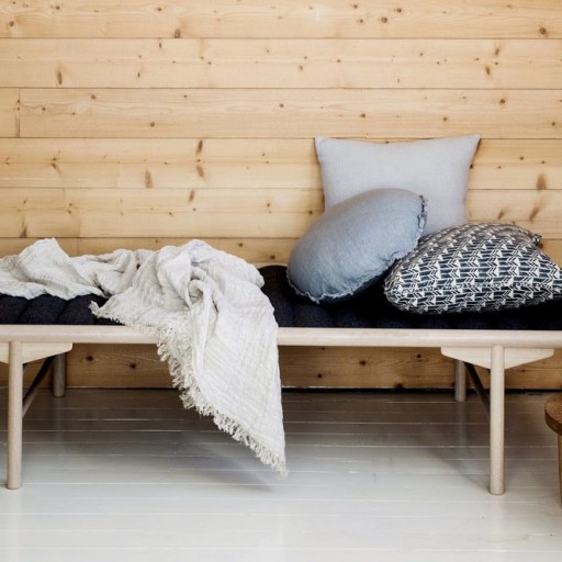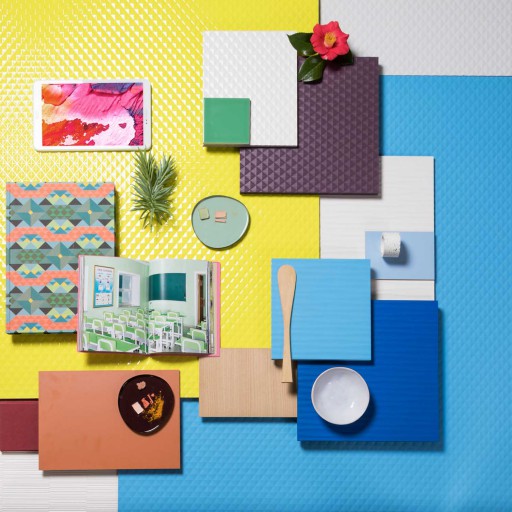
For years, talking about neutral tones meant navigating a relatively predictable territory of whites, greys, and beiges. In 2026, that definition expands. Colour remains important, but it can no longer be separated from what underpins it: texture, brightness, grain, relief and response to light.
This is one of the key takeaways from this year’s CMF (Colour, Material & Finish). At Milan Design Week 2026, the search for greater warmth coexisted with tactile surfaces, natural stone, wood, and matte finishes; Architectural Digest also detected a resurgence of wood and materials that invite touch, while the Fuorisalone presentations placed materials, colours, and surfaces within a single narrative.
Neutrals, therefore, are no longer necessarily silent. These four families show how they are acquiring character.
Beige: from background to material
Beige remains a great starting point, but it’s moving away from uniformity. Now it’s appealing when it evokes something, whether it’s stone, sand, bleached wood, or weathered surfaces.
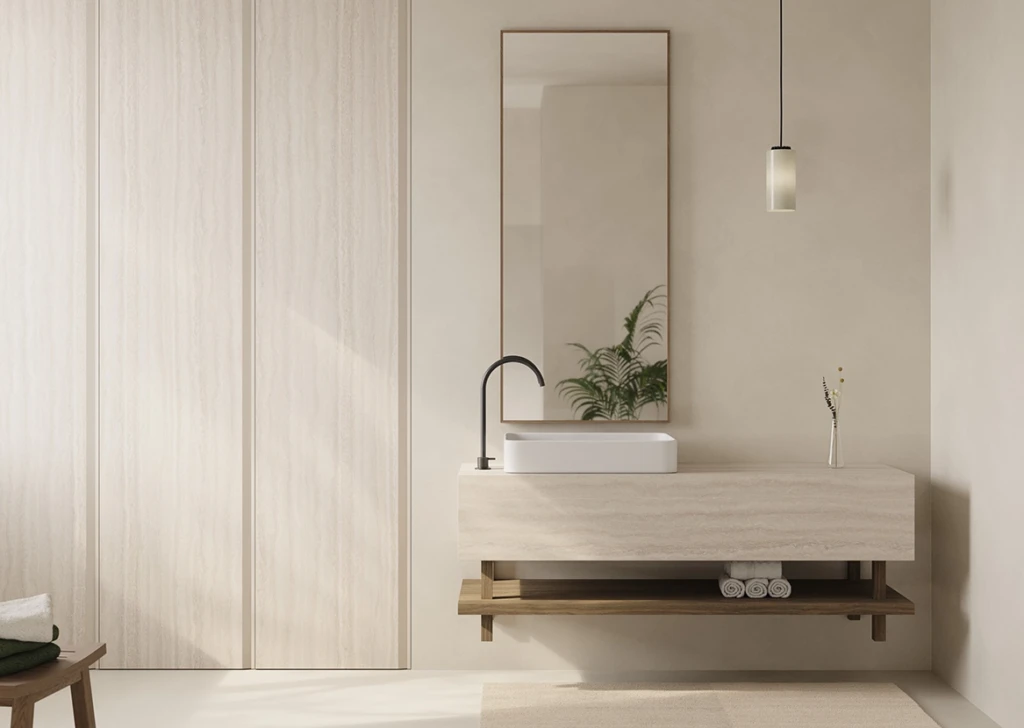
In Creamy Travertino Balm from the Duo range, the veining and irregular porosity reinterpret travertine with a warm and luminous tone. The Balm super-matt finish also reduces light reflection and enhances its tactile quality.
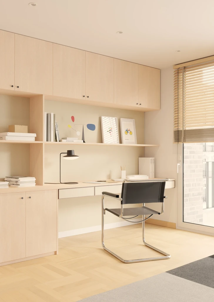
Another way to achieve the same effect is with Roble Vela Fado from the Studio range. It’s a light white oak with a whitish tone, whose grain adds depth and variation to the beige. The Fado finish synchronises pattern and texture through a deep, synchronised texture, making neutrality no longer solely dependent on tone.
Merino: the allure of the undefined
Between grey and beige appears another of the most interesting contemporary neutrals, one that is difficult to name.
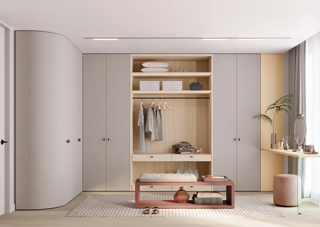
This is the Merino Bolero finish from the Studio range, a warm grey with subtle beige and pink undertones. Its Bolero finish introduces a deep wood grain that creates a stained surface effect: colour and texture work as one.
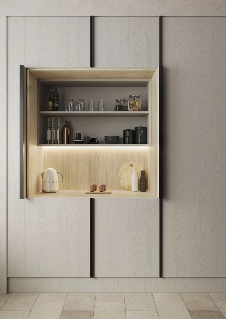
Alongside it, Tailor Stone Ari, from the Duo range, brings warm grey into the world of textile. Inspired by a cool wool fabric, its fine stippling and Ari finish offer an organic feel, demonstrating that a neutral can gain complexity without increasing its chromatic intensity.
Brown: regain depth
While beige brightens, brown adds weight to a space. The revival of dark woods, chocolates, and deep earth tones reflects a desire for more inviting interiors, a departure from the white and grey minimalism of previous years. In Milan, warm browns and clay palettes coexisted with softened neutrals and natural textures.
Diana Walnut Boreal, from the Duo range, takes this trend to dark walnut, with wide cathedrals and a grain with a strong visual presence.
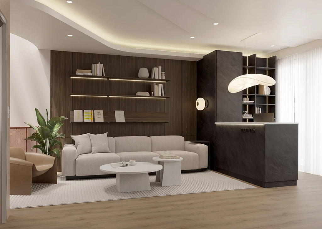
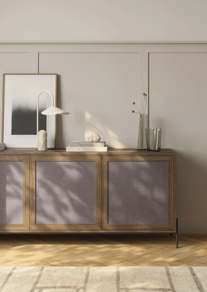
Linum Marrón, by Fabric, proposes a different approach with a surface made with real textile fibres, in a deep texture, dark brown, where colour, texture and touch are inseparable.
Earth: when neutral starts to become colour
The final frontier lies in tones that a few years ago we might not have called neutrals. Buttery yellows, cereals, sands, and camel are beginning to work as calming bases and as an alternative to pure Blanco that offers more character.
Mantequilla Supermate, from the Duo range, is a very light yellow, somewhere between cream, pastel, and vanilla. The Supermate treatment itself enhances its powdery character.
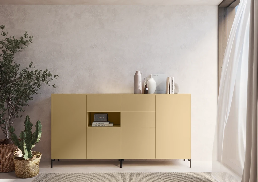
Avena Soft III, also from Duo, features a soft camel colour. Its warmth, luminosity, and subtle connection to nature make it an Ideal base for creating welcoming, serene, and timeless spaces.
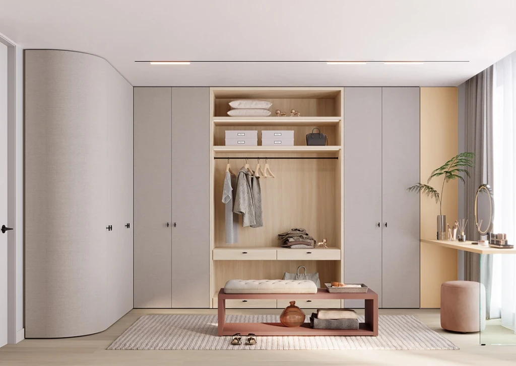
Neutral in 2026 is no longer defined so much by the absence of colour as by its ability to create an atmosphere. From stone to textile and from dark wood to butter yellow, neutrality becomes less flat, more tactile, and above all, more material.