Colour is a cheap way to transform spaces, but it is also just one of many elements of a project. Even though Pantone is telling us that we must use Living Coral this year, it all depends on how you look at it.
Living Coral before Pantone: Colombo and Serboli
Matteo Colombo and Andrea Serboli are the heart and soul of Colombo and Serboli Architecture, CaSA. You could call these two Barcelona-based Italians “visionaries”, since they took a chance on Living Coral before Pantone chose it as colour of the year.
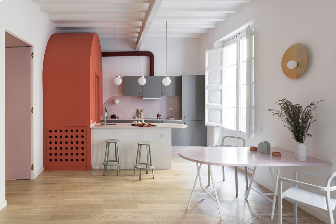
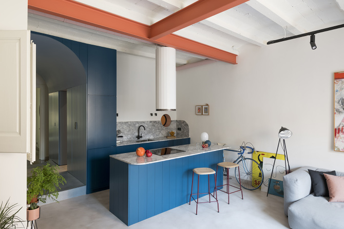
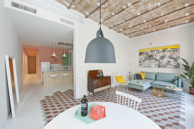
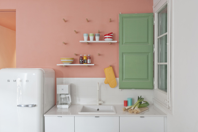
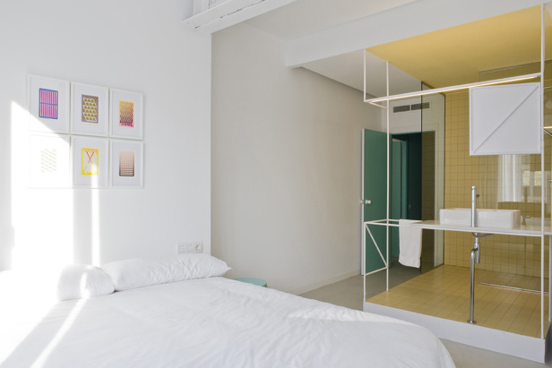
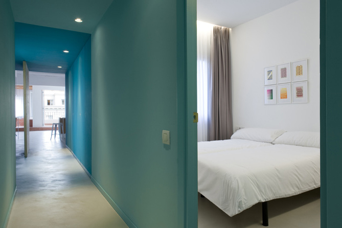
In 2017, they renovated an apartment in El Born in Barcelona using coral “in reference to the Mediterranean and the classic, and contrasted it with the deep blue of the custom-made storage furniture”. In 2018, they did it again for the renovation of Font 6 apartment, the home of Andrea Serboli, using a lighter and brighter tone of coral “because it was for specific accents: the supporting beam that crosses the living room, the custom-made bathroom cabinet, the laundry door on the terrace…”. These apartments are “two examples of how a specific shade can be used for very different purposes”.
How to use Living Coral in interior design: Estudio Alegría
Pantone defines Living Coral, the Colour of the Year 2019, as a colour that’s full of life and energy. Ignacio Alegría and Manuel Such from Estudio Alegría both agree, but they believe “it also gives the space a warmth, transmits passion and dynamism, and has an intense yet soft character. We know that using it awakens interest without losing simplicity or elegance”.
If you are wondering how to incorporate it into your home, Estudio Alegría says the easiest way to play with such an intense colour is to introduce textiles and small objects into a space with neutral tones or, by contrast, with strong shades like greys and dark blues. However, we can also decide to make it the protagonist by choosing to “colour an entire space with this vigorous shade. By combining it with different materials, such as white tiles and black accessories, we get a very impactful space”. Living Coral allows us to create many different layouts and strengthen many different styles of decoration. For example, “it works well in sophisticated atmospheres by combining it with stones in dark colours, and it also works well with wood and natural tones”.
Their studio is currently wrapping up a project in Valencia in which one of the rooms has a playful character and uses coral to highlight certain elements. Their inspirations include Marcante Testa’s apartment in Milan, which plays with the changing of colour to emphasise contrasts between rooms.
For Colombo and Serboli, “each colour and each combination of colours depends on many factors: the place, the client, the lighting, whether it’s about big surfaces or details, etc.”. That’s why they would consider using coral in any project or room, because “all colours and elements of a project depend on many others, and it’s the combination of all these things that create the result”.
Colour for transforming spaces
Colour is a cheap way to completely transform spaces. This duo of Italian architects started experimenting with the colour in their holiday apartment projects, such as Rocha Apartment or Tyche Apartment which were created with short stays in mind. In these projects they allowed themselves to “be more daring” than in a normal residence and it made the apartments more attractive in the world of online sales. They then continued to use the colour in projects that it suited, depending on the client profile and the objectives, such as the apartments in Barcelona.
However, they also have many other projects that are dominated by neutral tones or that have been thought out with tactile materials in mind. Because, for CaSA, pre-established colour palettes don’t exist. Each project is made-to-measure, and they can “play with contrasts, or use more subtle tones”. In their studio, they consider colour to be “another element that serves the project”.
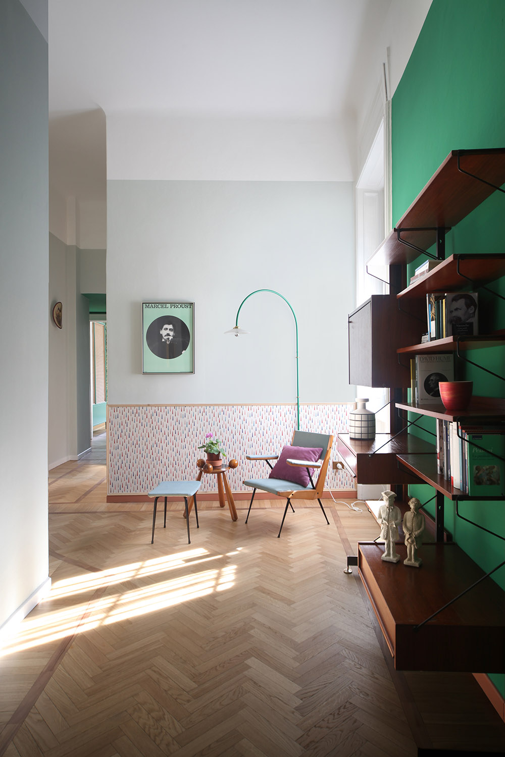
Neutral tones are the foundation of the balance found in Estudio Alegría’s projects, but they like to disrupt the calm with an element that has a stronger tone, playing with volume and texture: “We like soft tones and pastels very much, however, we never say no to a vibrant colour when the project requires it”.
Since each project is made-to-measure, the colour palette depends on the project and the client, but they consider colour to be a key element in each and every one of their projects: “Knowing how to play with them, to combine shades, to take a chance on a colour palette and make the space flow so that everything is in harmony and good taste, is our objective”.
What influence does Pantone’s Colour of the year have?
At CaSa they acknowledge that “there are trends floating around that we inevitably absorb”. However, when it comes to proposing a project, their objective is to create timeless spaces that are enjoyed over time. So what’s the point of including the colour of the moment if it then goes out of fashion?
“To make sure that the space works over time, one must know how to employ trends in just the right amount”, says Estudio Alegría. They always keep an eye out for aesthetic trends as well as the choice for Colour of the Year, which they see as a fun moment because “it is very important to have your eyes open, to know what is happening in the world and how to reinterpret it in our work”.
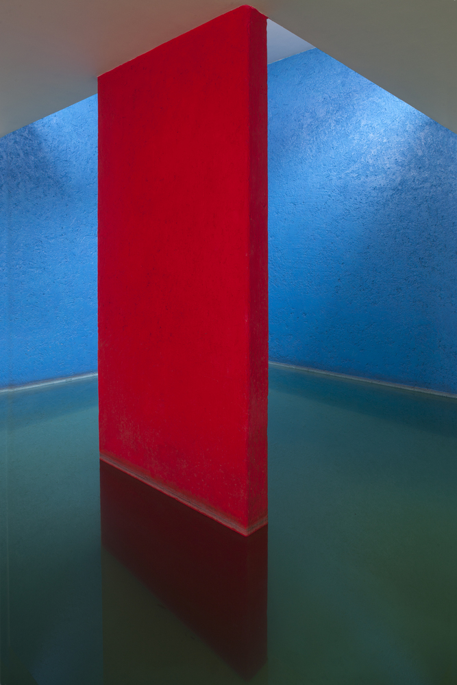
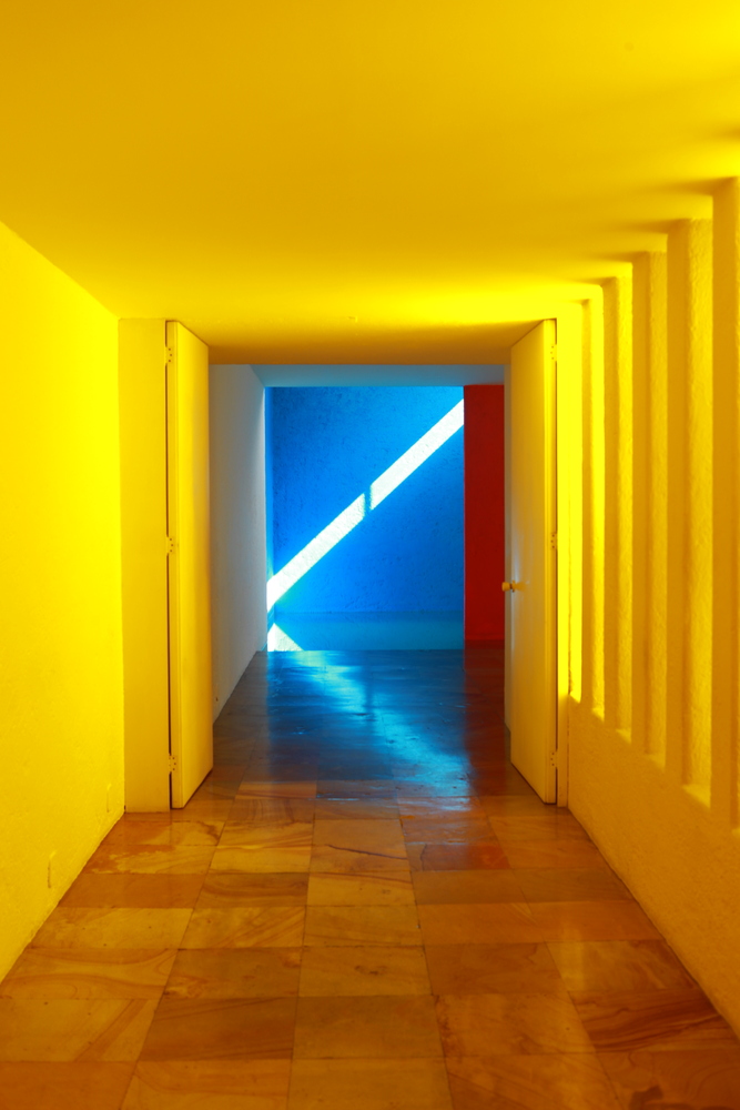
“A great architect that used colour in a daring way was Luis Barragán. Decades later, his projects and colours continue to have the same strength and meaning. That’s what we would like to have happen to us”, Colombo and Serboli confess.